Ipl 2023 Batting Analysis
Mon 30 June 2025
import pandas as pd
import matplotlib.pyplot as plt
import seaborn as sns
df = pd.read_csv(r'C:\datasets\ipl_2023_batting.csv')
df
| Player | Runs | Matches | Balls | Strike Rate | Average | |
|---|---|---|---|---|---|---|
| 0 | Shubman Gill | 890 | 17 | 550 | 162.0 | 59.3 |
| 1 | Faf du Plessis | 730 | 14 | 475 | 153.7 | 56.1 |
| 2 | Devdutt Padikkal | 421 | 15 | 360 | 117.0 | 35.1 |
| 3 | Virat Kohli | 639 | 14 | 432 | 147.9 | 53.3 |
| 4 | Ruturaj Gaikwad | 590 | 13 | 405 | 145.6 | 49.2 |
| 5 | David Warner | 516 | 14 | 378 | 136.5 | 44.0 |
| 6 | Suryakumar Yadav | 605 | 13 | 370 | 163.5 | 50.4 |
| 7 | MS Dhoni | 105 | 10 | 72 | 145.8 | 26.2 |
df.info()
<class 'pandas.core.frame.DataFrame'>
RangeIndex: 8 entries, 0 to 7
Data columns (total 6 columns):
 #   Column       Non-Null Count  Dtype
---  ------       --------------  -----
 0   Player       8 non-null      object
 1   Runs         8 non-null      int64
 2   Matches      8 non-null      int64
 3   Balls        8 non-null      int64
 4   Strike Rate  8 non-null      float64
 5   Average      8 non-null      float64
dtypes: float64(2), int64(3), object(1)
memory usage: 516.0+ bytes
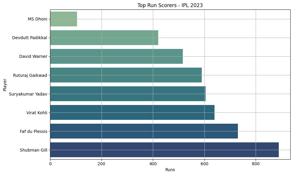
df.sort_values("Runs", ascending=False)
| Player | Runs | Matches | Balls | Strike Rate | Average | |
|---|---|---|---|---|---|---|
| 0 | Shubman Gill | 890 | 17 | 550 | 162.0 | 59.3 |
| 1 | Faf du Plessis | 730 | 14 | 475 | 153.7 | 56.1 |
| 3 | Virat Kohli | 639 | 14 | 432 | 147.9 | 53.3 |
| 6 | Suryakumar Yadav | 605 | 13 | 370 | 163.5 | 50.4 |
| 4 | Ruturaj Gaikwad | 590 | 13 | 405 | 145.6 | 49.2 |
| 5 | David Warner | 516 | 14 | 378 | 136.5 | 44.0 |
| 2 | Devdutt Padikkal | 421 | 15 | 360 | 117.0 | 35.1 |
| 7 | MS Dhoni | 105 | 10 | 72 | 145.8 | 26.2 |
plt.figure(figsize=(10,6))
sns.barplot(x="Runs", y="Player", data=df.sort_values("Runs"), palette="crest")
plt.title("Top Run Scorers - IPL 2023")
plt.xlabel("Runs")
plt.ylabel("Player")
plt.grid(True)
plt.tight_layout()
plt.show()
C:\Users\HP\AppData\Local\Temp\ipykernel_12800\3938584462.py:2: FutureWarning:

Passing `palette` without assigning `hue` is deprecated and will be removed in v0.14.0. Assign the `y` variable to `hue` and set `legend=False` for the same effect.

  sns.barplot(x="Runs", y="Player", data=df.sort_values("Runs"), palette="crest")
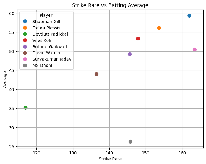
df.loc[df["Strike Rate"].idxmax()]
Player         Suryakumar Yadav
Runs                        605
Matches                      13
Balls                       370
Strike Rate               163.5
Average                    50.4
Name: 6, dtype: object
plt.figure(figsize=(8,6))
sns.scatterplot(data=df, x="Strike Rate", y="Average", hue="Player", s=100)
plt.title("Strike Rate vs Batting Average")
plt.grid(True)
plt.show()
Score: 5
Category: pandas-work