Data Visualization Master
Mon 30 June 2025
# Imports
import matplotlib.pyplot as plt
import seaborn as sns
import numpy as np
import pandas as pd
%matplotlib inline
# Sample Data
x = [1, 2, 3, 4, 5]
y = [10, 15, 13, 17, 20]
# DataFrame for seaborn
df = pd.DataFrame({
    'Day': ['Mon', 'Tue', 'Wed', 'Thu', 'Fri'],
    'Sales': [200, 300, 250, 400, 450],
    'Category': ['A', 'B', 'A', 'B', 'A']
})
df.head()
| Day | Sales | Category | |
|---|---|---|---|
| 0 | Mon | 200 | A |
| 1 | Tue | 300 | B |
| 2 | Wed | 250 | A |
| 3 | Thu | 400 | B |
| 4 | Fri | 450 | A |
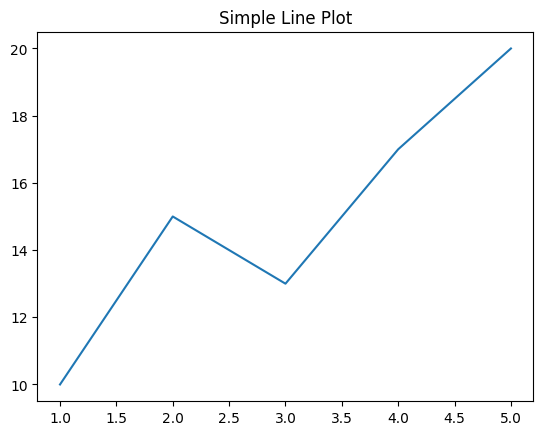
# Basic line plot
plt.plot(x, y)
plt.title("Simple Line Plot")
plt.show()
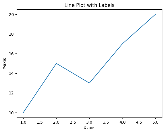
# Line plot with labels
plt.plot(x, y)
plt.xlabel("X-axis")
plt.ylabel("Y-axis")
plt.title("Line Plot with Labels")
plt.show()
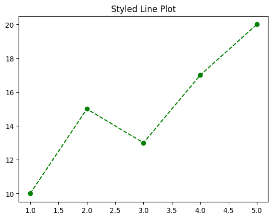
# Line color and style
plt.plot(x, y, color='green', linestyle='--', marker='o')
plt.title("Styled Line Plot")
plt.show()
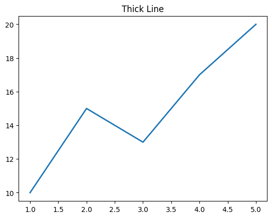
# Line thickness
plt.plot(x, y, linewidth=2)
plt.title("Thick Line")
plt.show()
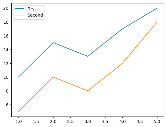
# Multiple lines
y2 = [5, 10, 8, 12, 18]
plt.plot(x, y, label='First')
plt.plot(x, y2, label='Second')
plt.legend()
plt.show()
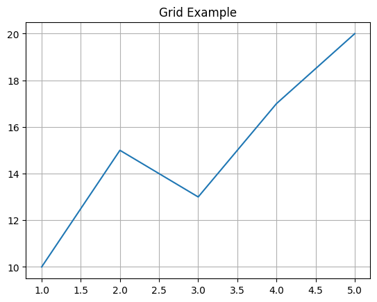
# Grid
plt.plot(x, y)
plt.grid(True)
plt.title("Grid Example")
plt.show()
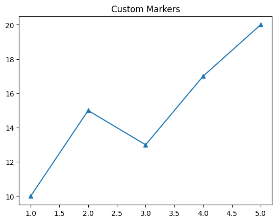
# Markers
plt.plot(x, y, marker='^')
plt.title("Custom Markers")
plt.show()
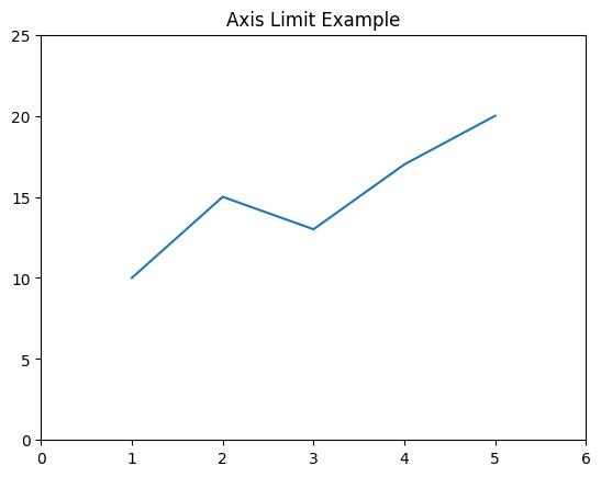
# Axis limits
plt.plot(x, y)
plt.ylim(0, 25)
plt.xlim(0, 6)
plt.title("Axis Limit Example")
plt.show()
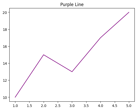
# Color
plt.plot(x, y, color='purple')
plt.title("Purple Line")
plt.show()
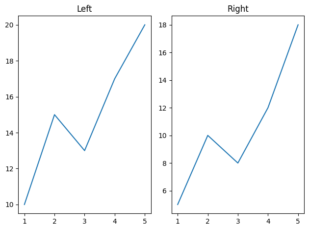
# Subplot 1x2
plt.subplot(1, 2, 1)
plt.plot(x, y)
plt.title("Left")

plt.subplot(1, 2, 2)
plt.plot(x, y2)
plt.title("Right")

plt.tight_layout()
plt.show()
# Bar chart
plt.bar(df['Day'], df['Sales'])
plt.title("Bar Chart")
plt.show()

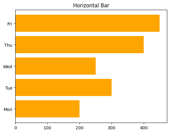
# Horizontal bar
plt.barh(df['Day'], df['Sales'], color='orange')
plt.title("Horizontal Bar")
plt.show()
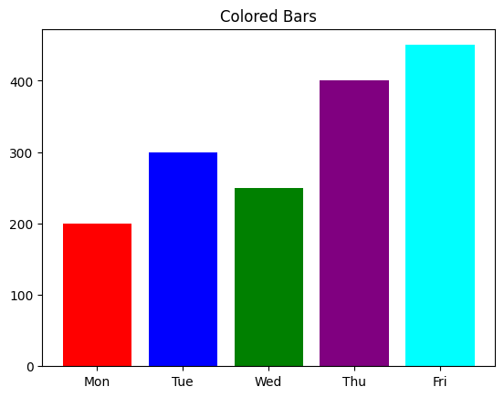
# Bar with color
colors = ['red', 'blue', 'green', 'purple', 'cyan']
plt.bar(df['Day'], df['Sales'], color=colors)
plt.title("Colored Bars")
plt.show()
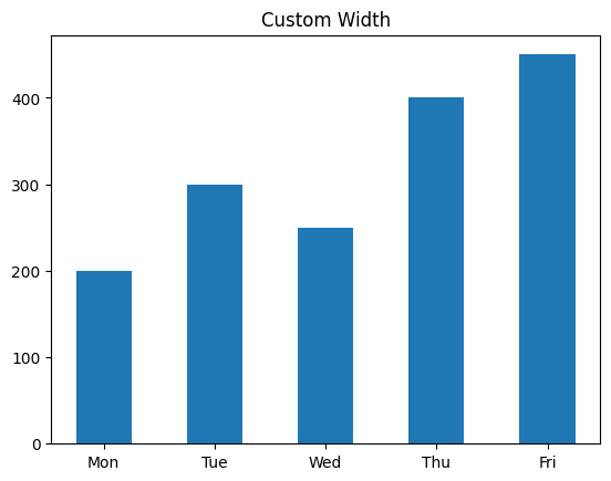
# Width
plt.bar(df['Day'], df['Sales'], width=0.5)
plt.title("Custom Width")
plt.show()
# Grouped bars
labels = ['G1', 'G2', 'G3']
a = [20, 34, 30]
b = [25, 32, 34]

x = np.arange(len(labels))
width = 0.35

fig, ax = plt.subplots()
ax.bar(x - width/2, a, width, label='A')
ax.bar(x + width/2, b, width, label='B')
ax.set_xticks(x)
ax.set_xticklabels(labels)
ax.legend()
plt.title("Grouped Bar Chart")
plt.show()
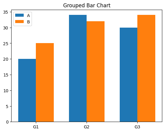
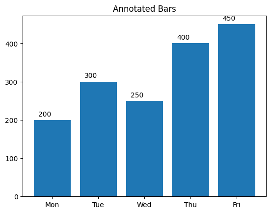
# Annotated bar chart
bars = plt.bar(df['Day'], df['Sales'])
for bar in bars:
    yval = bar.get_height()
    plt.text(bar.get_x() + 0.1, yval + 10, yval)
plt.title("Annotated Bars")
plt.show()
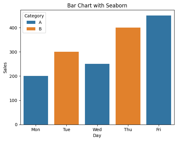
# Bar chart by category
sns.barplot(x='Day', y='Sales', hue='Category', data=df)
plt.title("Bar Chart with Seaborn")
plt.show()
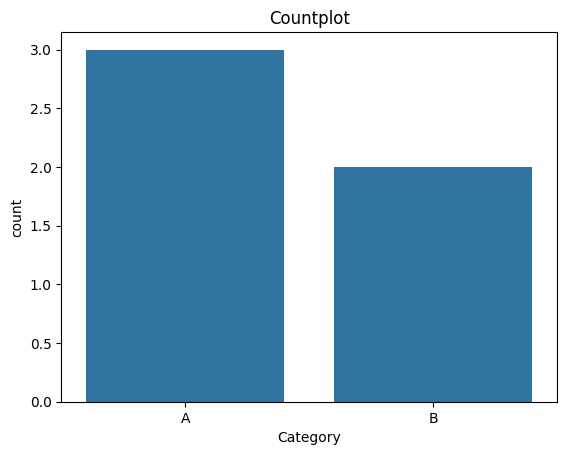
# Countplot
sns.countplot(x='Category', data=df)
plt.title("Countplot")
plt.show()
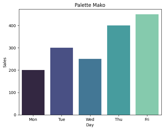
# Bar chart with palette
sns.barplot(x='Day', y='Sales', data=df, palette='mako')
plt.title("Palette Mako")
plt.show()
C:\Users\HP\AppData\Local\Temp\ipykernel_12360\1520212098.py:2: FutureWarning:

Passing `palette` without assigning `hue` is deprecated and will be removed in v0.14.0. Assign the `x` variable to `hue` and set `legend=False` for the same effect.

  sns.barplot(x='Day', y='Sales', data=df, palette='mako')
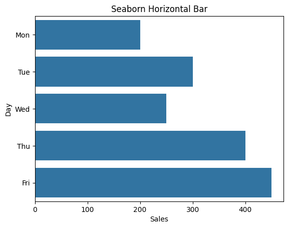
# Horizontal bar seaborn
sns.barplot(x='Sales', y='Day', data=df)
plt.title("Seaborn Horizontal Bar")
plt.show()
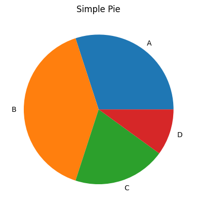
# Simple pie
sizes = [30, 40, 20, 10]
labels = ['A', 'B', 'C', 'D']
plt.pie(sizes, labels=labels)
plt.title("Simple Pie")
plt.show()
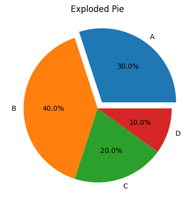
# Pie with explode
explode = (0.1, 0, 0, 0)
plt.pie(sizes, labels=labels, explode=explode, autopct='%1.1f%%')
plt.title("Exploded Pie")
plt.show()
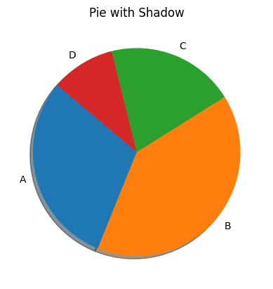
# Pie with shadow
plt.pie(sizes, labels=labels, shadow=True, startangle=140)
plt.title("Pie with Shadow")
plt.show()
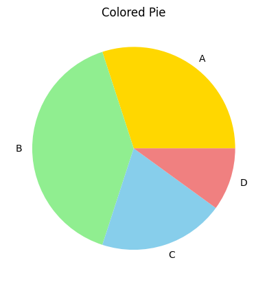
# Pie with colors
colors = ['gold', 'lightgreen', 'skyblue', 'lightcoral']
plt.pie(sizes, labels=labels, colors=colors)
plt.title("Colored Pie")
plt.show()
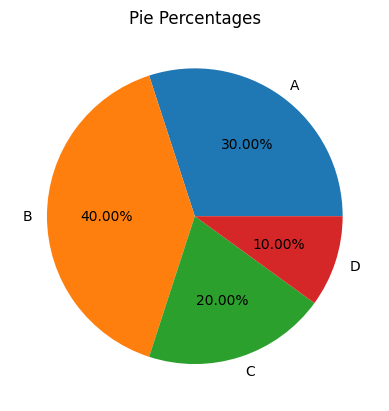
# Pie with percentages
plt.pie(sizes, labels=labels, autopct='%1.2f%%')
plt.title("Pie Percentages")
plt.show()
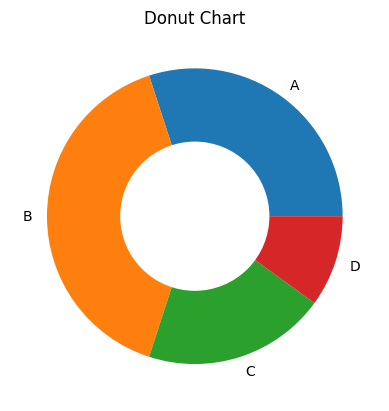
# Donut chart
plt.pie(sizes, labels=labels)
plt.gca().add_artist(plt.Circle((0,0), 0.5, color='white'))
plt.title("Donut Chart")
plt.show()
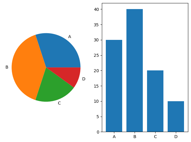
# Pie + bar side by side
plt.subplot(1, 2, 1)
plt.pie(sizes, labels=labels)
plt.subplot(1, 2, 2)
plt.bar(labels, sizes)
plt.tight_layout()
plt.show()
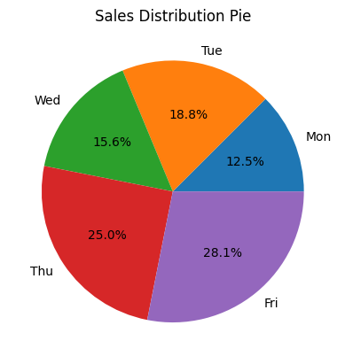
# Pie from dataframe
sales = df['Sales']
plt.pie(sales, labels=df['Day'], autopct='%1.1f%%')
plt.title("Sales Distribution Pie")
plt.show()
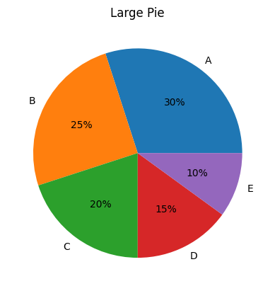
# Pie with large dataset
labels = ['A', 'B', 'C', 'D', 'E']
values = [30, 25, 20, 15, 10]
plt.pie(values, labels=labels, autopct='%1.0f%%')
plt.title("Large Pie")
plt.show()
# Pie chart rotated
plt.pie(sizes, labels=labels, startangle=90)
plt.title("Rotated Pie")
plt.show()
---------------------------------------------------------------------------

ValueError                                Traceback (most recent call last)

Cell In[35], line 2
      1 # Pie chart rotated
----> 2 plt.pie(sizes, labels=labels, startangle=90)
      3 plt.title("Rotated Pie")
      4 plt.show()


File ~\AppData\Roaming\Python\Python312\site-packages\matplotlib\pyplot.py:3762, in pie(x, explode, labels, colors, autopct, pctdistance, shadow, labeldistance, startangle, radius, counterclock, wedgeprops, textprops, center, frame, rotatelabels, normalize, hatch, data)
   3739 @_copy_docstring_and_deprecators(Axes.pie)
   3740 def pie(
   3741     x: ArrayLike,
   (...)   3760     data=None,
   3761 ) -> tuple[list[Wedge], list[Text]] | tuple[list[Wedge], list[Text], list[Text]]:
-> 3762     return gca().pie(
   3763         x,
   3764         explode=explode,
   3765         labels=labels,
   3766         colors=colors,
   3767         autopct=autopct,
   3768         pctdistance=pctdistance,
   3769         shadow=shadow,
   3770         labeldistance=labeldistance,
   3771         startangle=startangle,
   3772         radius=radius,
   3773         counterclock=counterclock,
   3774         wedgeprops=wedgeprops,
   3775         textprops=textprops,
   3776         center=center,
   3777         frame=frame,
   3778         rotatelabels=rotatelabels,
   3779         normalize=normalize,
   3780         hatch=hatch,
   3781         **({"data": data} if data is not None else {}),
   3782     )


File ~\AppData\Roaming\Python\Python312\site-packages\matplotlib\__init__.py:1473, in _preprocess_data.<locals>.inner(ax, data, *args, **kwargs)
   1470 @functools.wraps(func)
   1471 def inner(ax, *args, data=None, **kwargs):
   1472     if data is None:
-> 1473         return func(
   1474             ax,
   1475             *map(sanitize_sequence, args),
   1476             **{k: sanitize_sequence(v) for k, v in kwargs.items()})
   1478     bound = new_sig.bind(ax, *args, **kwargs)
   1479     auto_label = (bound.arguments.get(label_namer)
   1480                   or bound.kwargs.get(label_namer))


File ~\AppData\Roaming\Python\Python312\site-packages\matplotlib\axes\_axes.py:3298, in Axes.pie(self, x, explode, labels, colors, autopct, pctdistance, shadow, labeldistance, startangle, radius, counterclock, wedgeprops, textprops, center, frame, rotatelabels, normalize, hatch)
   3296     explode = [0] * len(x)
   3297 if len(x) != len(labels):
-> 3298     raise ValueError("'label' must be of length 'x'")
   3299 if len(x) != len(explode):
   3300     raise ValueError("'explode' must be of length 'x'")


ValueError: 'label' must be of length 'x'
# Histogram
data = np.random.randn(100)
plt.hist(data)
plt.title("Histogram")
plt.show()
# Histogram bins
plt.hist(data, bins=20, color='teal')
plt.title("Histogram with Bins")
plt.show()
# KDE plot
sns.kdeplot(data)
plt.title("KDE Plot")
plt.show()
# KDE shade
sns.kdeplot(data, shade=True)
plt.title("KDE with Shade")
plt.show()
# KDE + Histogram
sns.histplot(data, kde=True)
plt.title("Histogram with KDE")
plt.show()
# Boxplot
tips = sns.load_dataset("tips")
sns.boxplot(x=tips['total_bill'])
plt.title("Boxplot of Total Bill")
plt.show()
# Boxplot by category
sns.boxplot(x='day', y='total_bill', data=tips)
plt.title("Boxplot by Day")
plt.show()
# Violin plot
sns.violinplot(x='day', y='total_bill', data=tips)
plt.title("Violin Plot")
plt.show()
# Swarm plot
sns.swarmplot(x='day', y='total_bill', data=tips)
plt.title("Swarm Plot")
plt.show()
# Combined swarm + violin
sns.violinplot(x='day', y='total_bill', data=tips, inner=None)
sns.swarmplot(x='day', y='total_bill', data=tips, color='k', alpha=0.5)
plt.title("Violin + Swarm")
plt.show()
# Scatter plot
plt.scatter(df['Sales'], [1,2,3,4,5])
plt.title("Scatter Plot")
plt.show()
# Scatter with color
colors = ['red', 'blue', 'green', 'orange', 'purple']
plt.scatter(df['Sales'], [1,2,3,4,5], c=colors)
plt.title("Colored Scatter")
plt.show()
# Seaborn scatter
sns.scatterplot(x='Day', y='Sales', hue='Category', data=df)
plt.title("Seaborn Scatter")
plt.show()
# Pairplot
sns.pairplot(tips)
plt.suptitle("Pairplot of Tips", y=1.02)
plt.show()
# Pairplot
sns.pairplot(tips)
plt.suptitle("Pairplot of Tips", y=1.02)
plt.show()
# Heatmap
corr = tips.corr()
sns.heatmap(corr, annot=True, cmap='coolwarm')
plt.title("Correlation Heatmap")
plt.show()
# Heatmap without annotations
sns.heatmap(corr, cmap='YlGnBu')
plt.title("Heatmap No Annot")
plt.show()
# Subplot 2x2
fig, axs = plt.subplots(2, 2)
axs[0, 0].plot(x, y)
axs[0, 1].bar(df['Day'], df['Sales'])
axs[1, 0].pie(sizes, labels=labels)
axs[1, 1].hist(data)
plt.tight_layout()
plt.show()
# Dark theme
plt.style.use('dark_background')
plt.plot(x, y)
plt.title("Dark Theme Plot")
plt.show()
---------------------------------------------------------------------------

ValueError                                Traceback (most recent call last)

Cell In[36], line 3
      1 # Dark theme
      2 plt.style.use('dark_background')
----> 3 plt.plot(x, y)
      4 plt.title("Dark Theme Plot")
      5 plt.show()


File ~\AppData\Roaming\Python\Python312\site-packages\matplotlib\pyplot.py:3794, in plot(scalex, scaley, data, *args, **kwargs)
   3786 @_copy_docstring_and_deprecators(Axes.plot)
   3787 def plot(
   3788     *args: float | ArrayLike | str,
   (...)   3792     **kwargs,
   3793 ) -> list[Line2D]:
-> 3794     return gca().plot(
   3795         *args,
   3796         scalex=scalex,
   3797         scaley=scaley,
   3798         **({"data": data} if data is not None else {}),
   3799         **kwargs,
   3800     )


File ~\AppData\Roaming\Python\Python312\site-packages\matplotlib\axes\_axes.py:1779, in Axes.plot(self, scalex, scaley, data, *args, **kwargs)
   1536 """
   1537 Plot y versus x as lines and/or markers.
   1538
   (...)   1776 (``'green'``) or hex strings (``'#008000'``).
   1777 """
   1778 kwargs = cbook.normalize_kwargs(kwargs, mlines.Line2D)
-> 1779 lines = [*self._get_lines(self, *args, data=data, **kwargs)]
   1780 for line in lines:
   1781     self.add_line(line)


File ~\AppData\Roaming\Python\Python312\site-packages\matplotlib\axes\_base.py:296, in _process_plot_var_args.__call__(self, axes, data, *args, **kwargs)
    294     this += args[0],
    295     args = args[1:]
--> 296 yield from self._plot_args(
    297     axes, this, kwargs, ambiguous_fmt_datakey=ambiguous_fmt_datakey)


File ~\AppData\Roaming\Python\Python312\site-packages\matplotlib\axes\_base.py:486, in _process_plot_var_args._plot_args(self, axes, tup, kwargs, return_kwargs, ambiguous_fmt_datakey)
    483     axes.yaxis.update_units(y)
    485 if x.shape[0] != y.shape[0]:
--> 486     raise ValueError(f"x and y must have same first dimension, but "
    487                      f"have shapes {x.shape} and {y.shape}")
    488 if x.ndim > 2 or y.ndim > 2:
    489     raise ValueError(f"x and y can be no greater than 2D, but have "
    490                      f"shapes {x.shape} and {y.shape}")


ValueError: x and y must have same first dimension, but have shapes (3,) and (5,)
# Reset style
plt.style.use('default')
# Save figure
plt.plot(x, y)
plt.savefig("plot.png")
plt.title("Saved Plot")
plt.show()
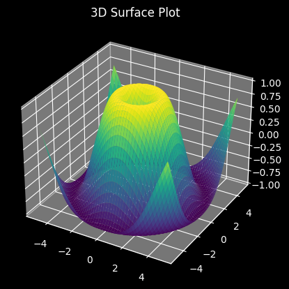
# 3D Surface Plot (if matplotlib 3D enabled)
from mpl_toolkits.mplot3d import Axes3D
fig = plt.figure()
ax = fig.add_subplot(111, projection='3d')
X, Y = np.meshgrid(np.linspace(-5, 5, 100), np.linspace(-5, 5, 100))
Z = np.sin(np.sqrt(X**2 + Y**2))
ax.plot_surface(X, Y, Z, cmap='viridis')
plt.title("3D Surface Plot")
plt.show()
# Rug plot
sns.rugplot(data, height=0.3)
plt.title("Rug Plot")
plt.show()
---------------------------------------------------------------------------

NameError                                 Traceback (most recent call last)

Cell In[38], line 2
      1 # Rug plot
----> 2 sns.rugplot(data, height=0.3)
      3 plt.title("Rug Plot")
      4 plt.show()


NameError: name 'data' is not defined
# Strip plot
sns.stripplot(x='day', y='total_bill', data=tips)
plt.title("Strip Plot")
plt.show()
---------------------------------------------------------------------------

NameError                                 Traceback (most recent call last)

Cell In[39], line 2
      1 # Strip plot
----> 2 sns.stripplot(x='day', y='total_bill', data=tips)
      3 plt.title("Strip Plot")
      4 plt.show()


NameError: name 'tips' is not defined
# Strip plot
sns.stripplot(x='day', y='total_bill', data=tips)
plt.title("Strip Plot")
plt.show()
---------------------------------------------------------------------------

NameError                                 Traceback (most recent call last)

Cell In[40], line 2
      1 # Strip plot
----> 2 sns.stripplot(x='day', y='total_bill', data=tips)
      3 plt.title("Strip Plot")
      4 plt.show()


NameError: name 'tips' is not defined
# Multi-hue bar plot
sns.barplot(x="day", y="tip", hue="sex", data=tips)
plt.title("Multi-Hue Bar")
plt.show()
---------------------------------------------------------------------------

NameError                                 Traceback (most recent call last)

Cell In[41], line 2
      1 # Multi-hue bar plot
----> 2 sns.barplot(x="day", y="tip", hue="sex", data=tips)
      3 plt.title("Multi-Hue Bar")
      4 plt.show()


NameError: name 'tips' is not defined
# Histogram + KDE + Style
sns.histplot(tips['total_bill'], kde=True, color='skyblue')
plt.title("Styled Hist + KDE")
plt.show()
---------------------------------------------------------------------------

NameError                                 Traceback (most recent call last)

Cell In[42], line 2
      1 # Histogram + KDE + Style
----> 2 sns.histplot(tips['total_bill'], kde=True, color='skyblue')
      3 plt.title("Styled Hist + KDE")
      4 plt.show()


NameError: name 'tips' is not defined
# Joint plot
sns.jointplot(x="total_bill", y="tip", data=tips, kind='reg')
plt.show()
---------------------------------------------------------------------------

NameError                                 Traceback (most recent call last)

Cell In[43], line 2
      1 # Joint plot
----> 2 sns.jointplot(x="total_bill", y="tip", data=tips, kind='reg')
      3 plt.show()


NameError: name 'tips' is not defined
# Set figure size
plt.figure(figsize=(8, 4))
plt.plot(x, y)
plt.title("Custom Size")
plt.show()
---------------------------------------------------------------------------

ValueError                                Traceback (most recent call last)

Cell In[44], line 3
      1 # Set figure size
      2 plt.figure(figsize=(8, 4))
----> 3 plt.plot(x, y)
      4 plt.title("Custom Size")
      5 plt.show()


File ~\AppData\Roaming\Python\Python312\site-packages\matplotlib\pyplot.py:3794, in plot(scalex, scaley, data, *args, **kwargs)
   3786 @_copy_docstring_and_deprecators(Axes.plot)
   3787 def plot(
   3788     *args: float | ArrayLike | str,
   (...)   3792     **kwargs,
   3793 ) -> list[Line2D]:
-> 3794     return gca().plot(
   3795         *args,
   3796         scalex=scalex,
   3797         scaley=scaley,
   3798         **({"data": data} if data is not None else {}),
   3799         **kwargs,
   3800     )


File ~\AppData\Roaming\Python\Python312\site-packages\matplotlib\axes\_axes.py:1779, in Axes.plot(self, scalex, scaley, data, *args, **kwargs)
   1536 """
   1537 Plot y versus x as lines and/or markers.
   1538
   (...)   1776 (``'green'``) or hex strings (``'#008000'``).
   1777 """
   1778 kwargs = cbook.normalize_kwargs(kwargs, mlines.Line2D)
-> 1779 lines = [*self._get_lines(self, *args, data=data, **kwargs)]
   1780 for line in lines:
   1781     self.add_line(line)


File ~\AppData\Roaming\Python\Python312\site-packages\matplotlib\axes\_base.py:296, in _process_plot_var_args.__call__(self, axes, data, *args, **kwargs)
    294     this += args[0],
    295     args = args[1:]
--> 296 yield from self._plot_args(
    297     axes, this, kwargs, ambiguous_fmt_datakey=ambiguous_fmt_datakey)


File ~\AppData\Roaming\Python\Python312\site-packages\matplotlib\axes\_base.py:486, in _process_plot_var_args._plot_args(self, axes, tup, kwargs, return_kwargs, ambiguous_fmt_datakey)
    483     axes.yaxis.update_units(y)
    485 if x.shape[0] != y.shape[0]:
--> 486     raise ValueError(f"x and y must have same first dimension, but "
    487                      f"have shapes {x.shape} and {y.shape}")
    488 if x.ndim > 2 or y.ndim > 2:
    489     raise ValueError(f"x and y can be no greater than 2D, but have "
    490                      f"shapes {x.shape} and {y.shape}")


ValueError: x and y must have same first dimension, but have shapes (3,) and (5,)
Score: 65
Category: pandas-work